Context
Baggage software that airlines and airports run on
SITA builds IT infrastructure for the air transport industry, software that airlines, airports, aircraft, and governments rely on to operate. I worked within the baggage portfolio, which includes Bag Manager, the system airline and airport staff use to track and manage checked bags, and WorldTracer, the industry-standard tool for tracing bags that get delayed, damaged, or lost across the global airline network.
Baggage handling is inherently cross-organizational: a single bag can pass through a departure airline, a connecting airline, and multiple airports before a passenger ever sees it again. Documentation and in-product writing for this portfolio had to work for airline staff, airport ground crews, and increasingly, passengers helping themselves.
My role
Documentation, style, and evangelizing UX writing
As Information Designer, I managed documentation and web-based help for the entire baggage portfolio. I worked cross-functionally with product teams through the full development lifecycle using agile methodology, so documentation and UX writing were built alongside features rather than bolted on after release.
Beyond the passenger flow, I wrote UI text for WorldTracer's employee flow for reporting lost baggage on iPads and computers, and for BagManager's admin and baggage handler flows, which were written for different devices, including handheld scanners for baggage handlers.
SITA had no company-wide writing standard when I joined, so I created a writing style guide and template for documentation and distributed it company-wide. Because UX writing wasn't yet a recognized discipline internally, a meaningful part of the role was evangelizing the value and impact of UX writing to senior leadership, making the case for why consistent, user-centered language mattered for products used across dozens of airlines and airports.
Self-service flow
WorldTracer: a touchless kiosk and mobile flow for reporting delayed or lost baggage
During the COVID-19 pandemic, I designed and wrote a workflow that let passengers report delayed or lost baggage in touchless mode, through an airport kiosk or their own phone. The kiosk had to do two things: tell passengers touchless mode was available, and mirror each step as they moved through the workflow on their phone. When a passenger approaches the kiosk, a call to action directs them to scan a QR code or go to a URL.
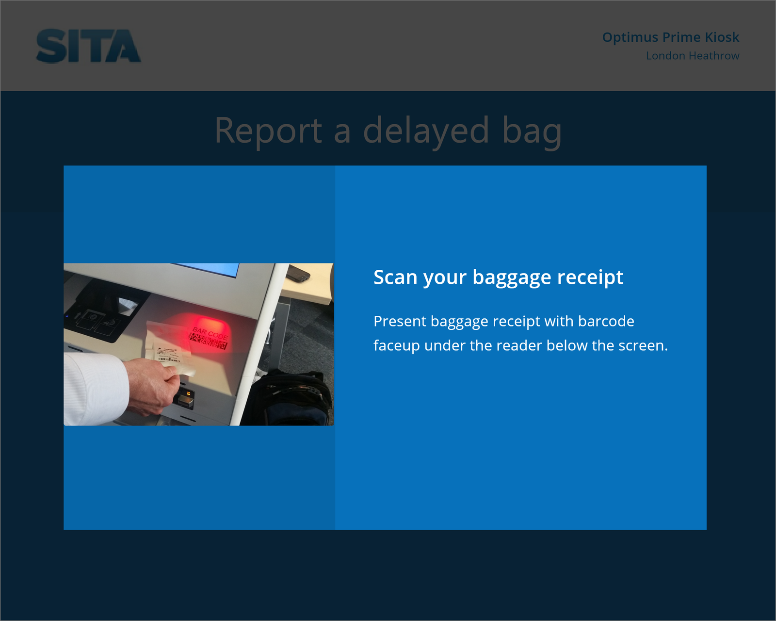
Scan the baggage receipt to start the report.
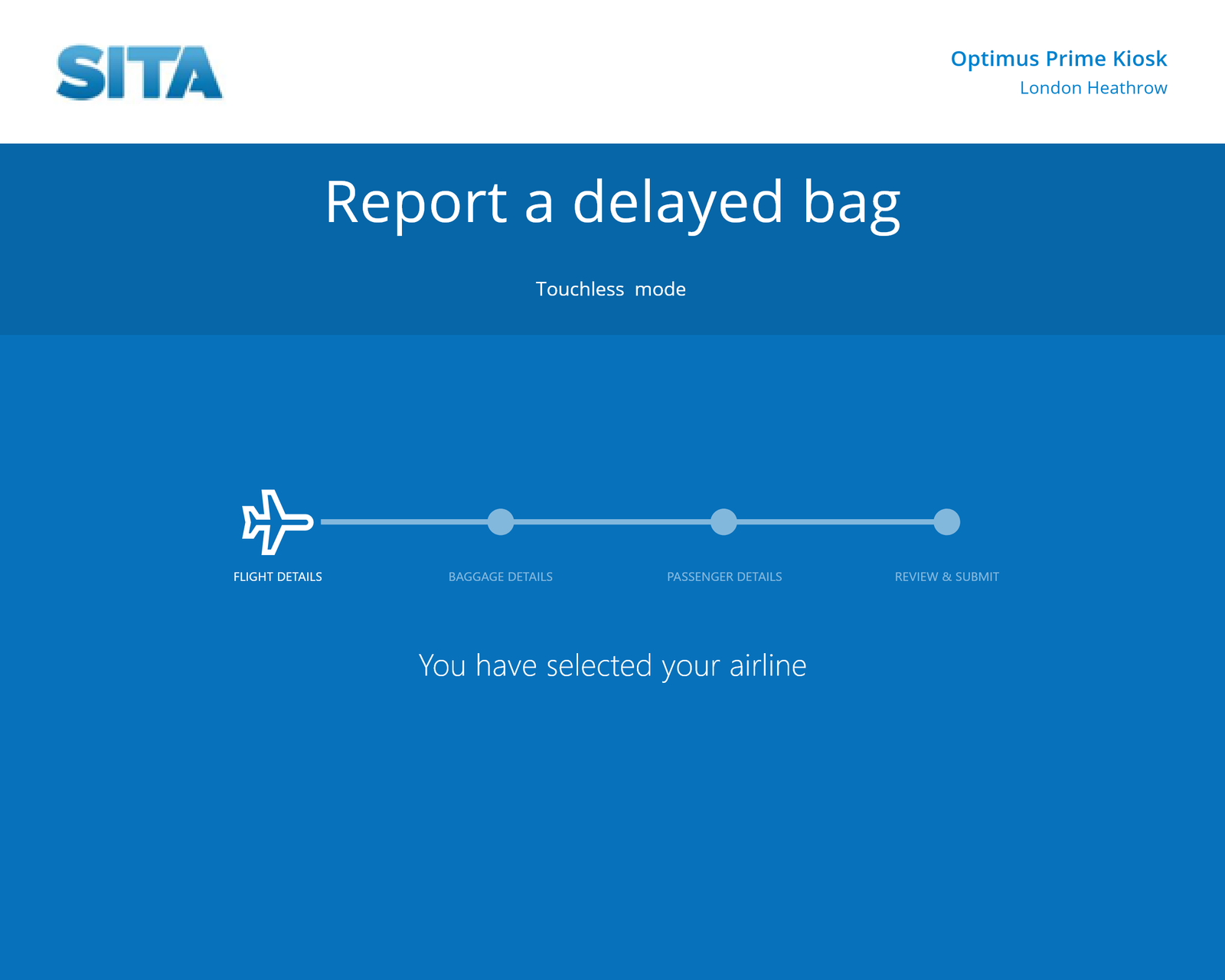
The kiosk shows passengers where they are in the process.
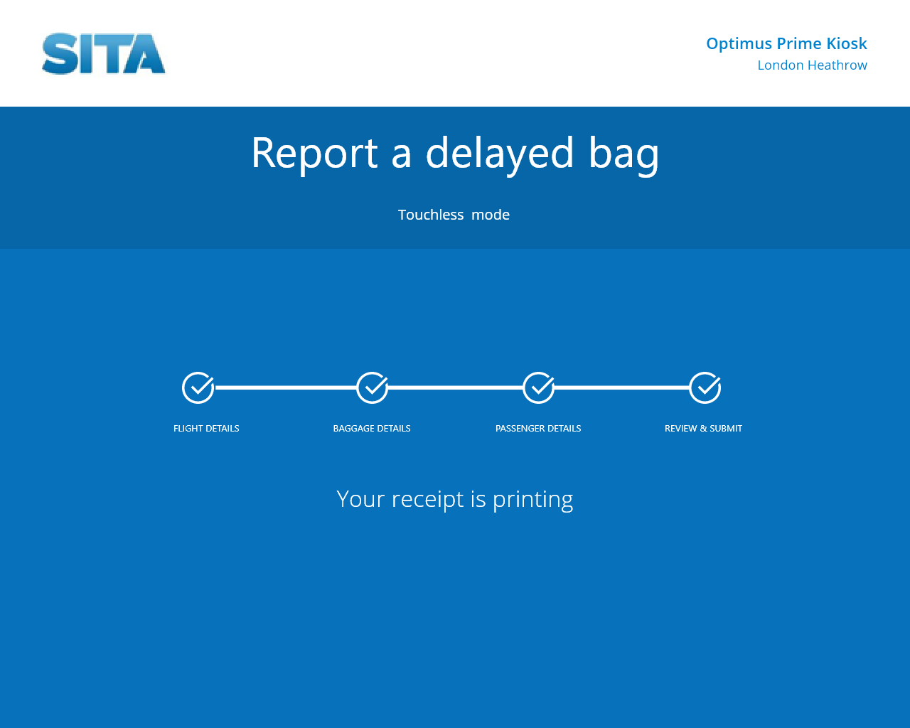
Because the kiosk is connected to the phone, passengers can use peripherals like printing with minimal contact.
The messaging also had to make passengers feel safe reporting delayed or lost baggage themselves.
Continuity
Handing the task off from kiosk to phone
The goal for mobile was to let passengers use their phone on its own, or together with a kiosk, to report delayed or lost baggage. The desktop version of the workflow already existed, so designing for mobile was a chance to fine-tune the language. Because of how much information a passenger has to submit, modals, selection menus, headlines, calls to action, confirmation, and error messaging all had to be consistent.
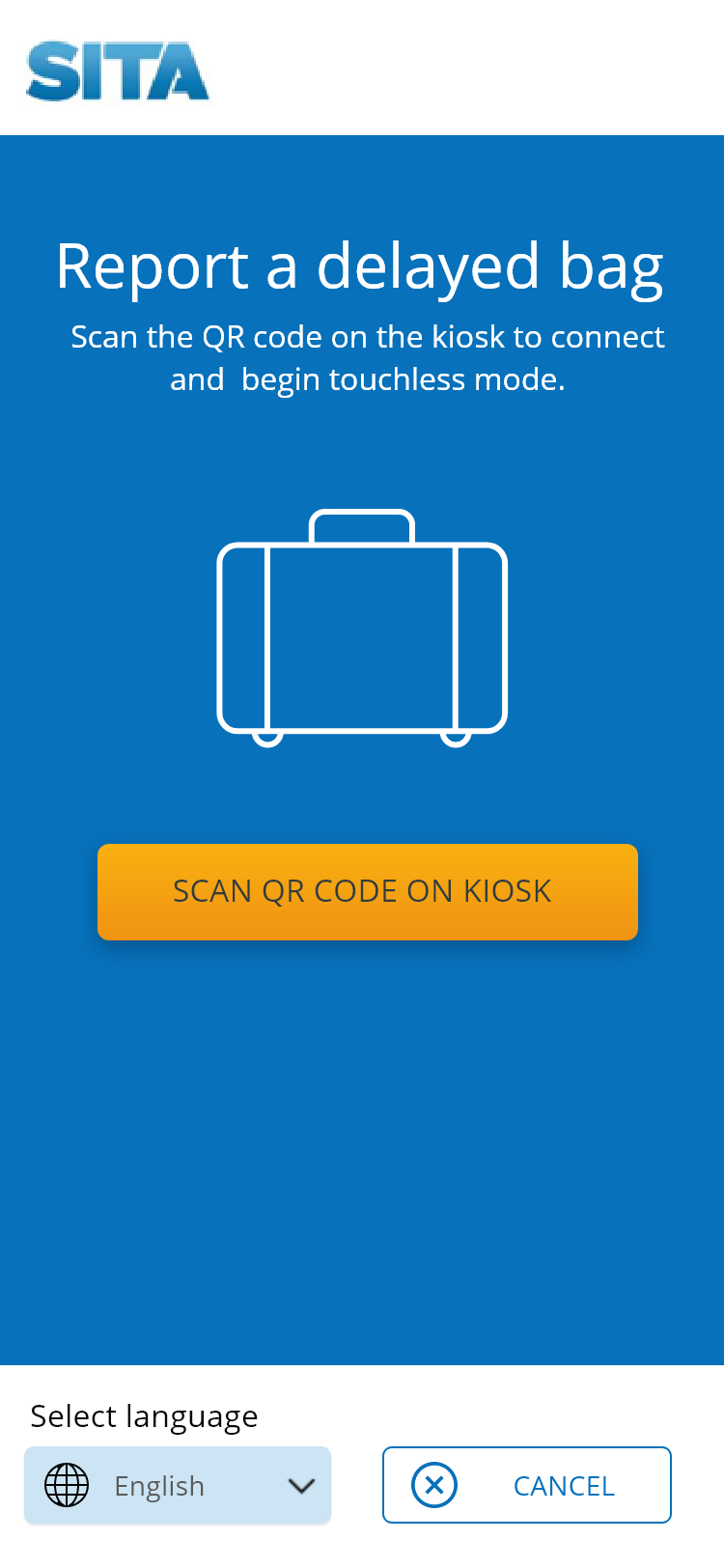
Start
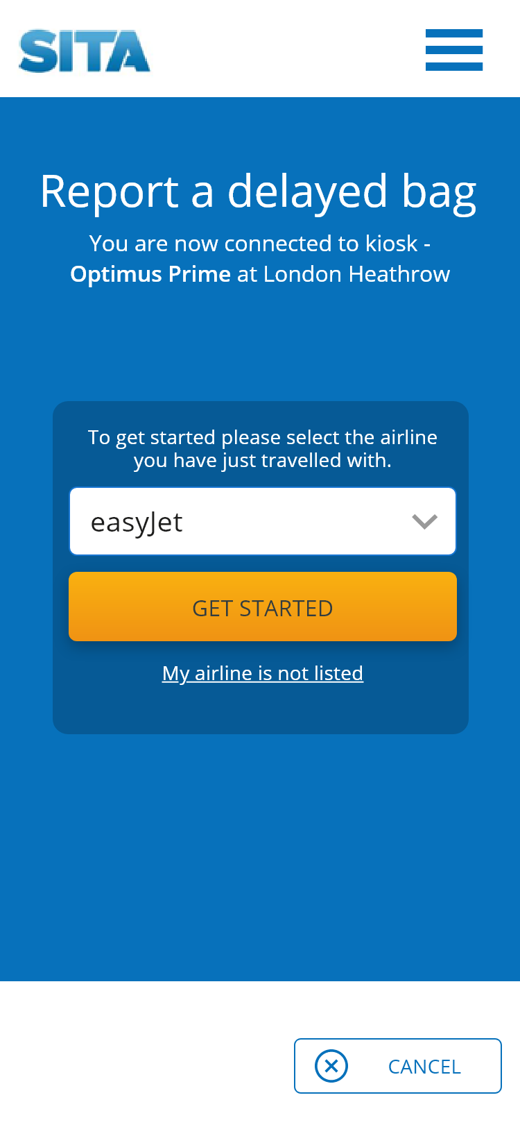
Connect
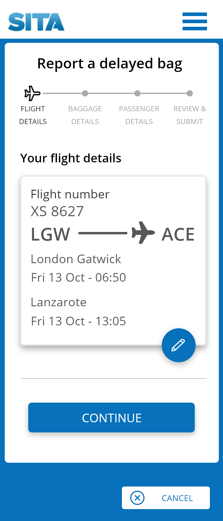
Flight details
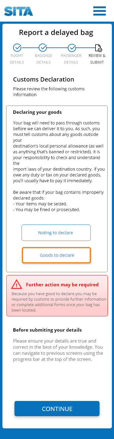
Customs
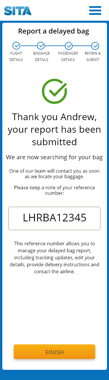
Confirmation
The customs declaration step carries real consequences (undeclared goods can mean fines or seizure), so that screen needed a warning that was impossible to miss without adding friction to the four screens around it that didn't need one.
The confirmation headline tells passengers their report has been submitted, and the call to action confirms there is nothing more for them to do. The result was a high-fidelity design, exported from Adobe XD with CSS, that the product team reviewed and approved.
Documentation
Rebuilding the BagManager online help
BagManager's existing online help linked to a PDF list of field descriptions. It wasn't informative, and it did little to make the application easier to use. I attended a BagManager training session to learn how different audiences use the product, then based the help on the web application's own navigation, so users could move through the help the way they move through the app. Each topic held the content, actions, and descriptions someone needs while working through their baggage process. I reviewed the content with subject matter experts and tested the output. The result was an HTML5 online help package for two user types, baggage handlers and baggage supervisors. Customers gave excellent feedback on the improvement, and the project earned a Bravo award for being completed in a short timeframe.
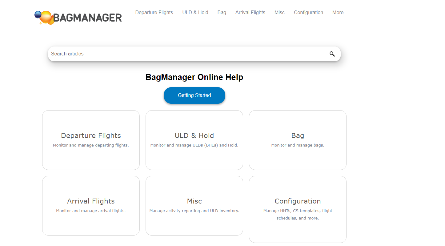
Bag Manager Online Help, structured to mirror the application's own navigation.
Outcomes
A documentation and writing standard built from scratch
This work laid the foundation for treating UX writing as a discipline at SITA, not just a documentation task.
Outcomes
Company-wide style guide
Created and distributed a writing style guide and documentation template used beyond the baggage portfolio, establishing a shared standard where none existed.
Help that mirrors the app
Replaced a PDF list of field descriptions with an HTML5 online help package for baggage handlers and supervisors, built on the application's own navigation. Customers gave excellent feedback, and the project earned a Bravo award.
Touchless lost-baggage reporting
Designed and wrote a kiosk and mobile workflow for reporting delayed or lost baggage during COVID-19, delivered as a high-fidelity design that the product team reviewed and approved.
Agile-embedded writing
Worked UX writing directly into the agile development lifecycle alongside product teams, rather than reviewing copy after design was finalized.
Leadership buy-in
Evangelized the value of UX writing to senior leadership at a company with no prior writing discipline, building the case for the role's continued investment.
Global-scale audience
Wrote for software used by airlines and airports worldwide, where unclear language has consequences for passengers and operations at real scale.