Context
What Redwood is and why content governance matters
Oracle's Redwood Design System is the foundational design language powering Oracle's entire enterprise product suite. Every application Oracle ships across HCM, ERP, CX, and beyond uses Redwood components. At that scale, inconsistent UI text is not a minor annoyance. It creates confusion for users, increases support burden, and erodes trust in the product.
The Redwood UI Text Writing Guidelines are the content governance layer of the design system. They define how every component should speak: what words to use in banners, how to write error messages, when to use "Copy" versus "Duplicate," how empty states should address the user. Without maintained, trusted guidelines, every product team makes these decisions independently, and the product fractures.
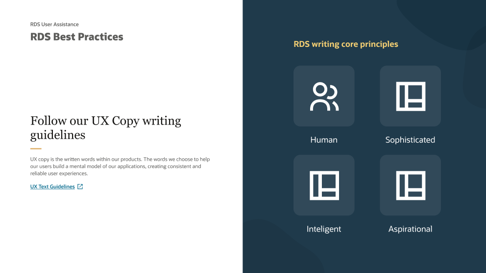
RDS Best Practices: the UX copy principles every Redwood product team designs against.
My role
What I owned and how I came to own it
I joined Oracle in August 2022 as a Senior UX Writer on the Redwood component team, focused on messaging components, banners, toasts, empty states, progress messages, and dialogs.
Two years into my tenure, my director and manager were laid off as part of Oracle's restructuring. Rather than wait for the working group to go dark, I stepped in and assumed full ownership of the Redwood UI Text Working Group, inheriting the weekly cadence and Slack support channel, and building new operational infrastructure to stabilize and scale the group's work.
"The goals of the working group are to maintain, update, triage, and proactively write guidance for UI text in Redwood designs. We run weekly meetings to discuss upcoming guidance changes and decisions, and provide an open forum for product writers."
In practice my role spanned four areas: governing the guidelines themselves, running the working group as a collaborative body, supporting the broader Oracle writing community through our Slack channel, and conducting original research to validate UI copy decisions.
The governance system
The infrastructure I built to make governance work
Good guidelines are only as valuable as the system that keeps them current, visible, and trusted. When I took over the working group, guidance requests were tracked informally in a Confluence page. I designed and built a proper operational infrastructure to change that.
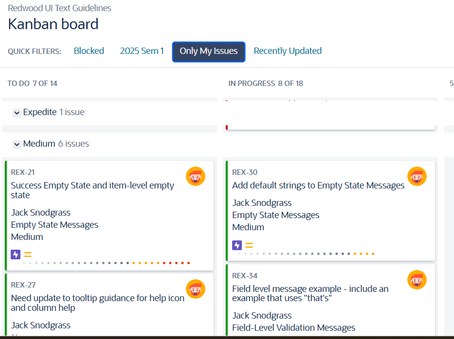
REX JIRA Kanban board I built for the working group, filtered to my own tickets.
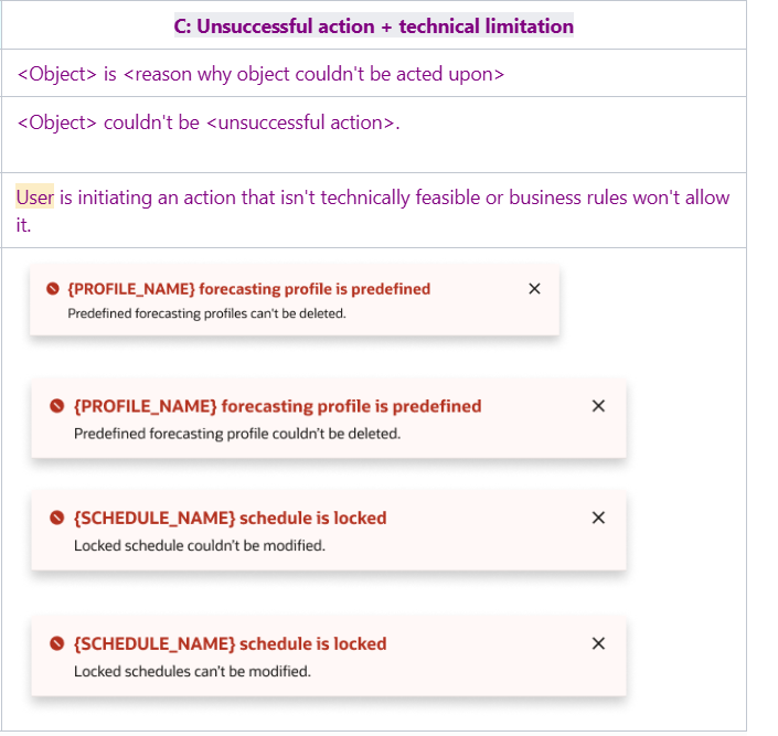
Guidance reference documentation the working group maintained and the Slack channel pointed writers to.
REX JIRA Kanban Board. I built and launched the working group's JIRA board to replace the ad hoc Confluence page. The board gave the group a structured, transparent backlog. Requests from the Slack channel and component owners were triaged, assigned, and tracked through completion. It also made the group's work visible to stakeholders who weren't in the room.
Weekly working group cadence. I chaired the weekly meeting where the group reviewed in-progress guidance, discussed upcoming component changes, and made decisions on contested terminology and patterns. Stakeholders from across Oracle (writers, designers, PMs, component owners) brought questions and requests.
UI Text Support Slack channel. The Slack channel was the front door for the broader Oracle writing community. Hundreds of writers, designers, and PMs used it to ask questions about writing guidance, surface edge cases, and flag inconsistencies. Responding to these questions and collecting feedback was a core part of how the guidelines stayed current and grounded in real usage.
The work
Four examples of guidance decisions and their impact
Each guidance update followed the same process: identify the problem, research and draft, review with stakeholders and the working group, approve, and announce to the organization. Here are four representative examples.
Banner Messages
Q4 Release
Problem
Multiple banner updates planned for Q4 release, including a new general success banner and support for secondary text and bullet lists. No guidance existed for how to write these new configurations.
Actions
Identified existing use cases in the Messages Repository tool. Drafted new writing guidance and reviewed with component stakeholders, product manager, designer, and design leadership. Iterated based on feedback.
Outcome
Approved guidance for new general success banner and banners with secondary text and bullet lists. Announced changes to the whole UX organization. Fine-tuned writing examples to support the updated guidelines.
Copy and Duplicate
Nomenclature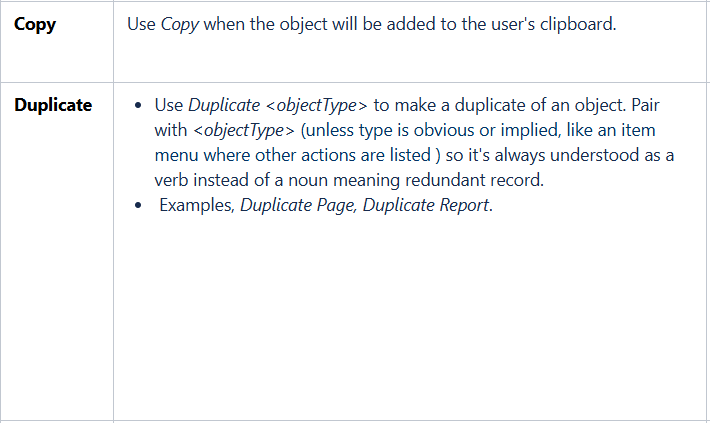
Problem
Product writers across Oracle were inconsistently using "Copy" and "Duplicate" as action labels. No definition existed in the UI Text Guidelines or the Oracle Style Guide, leading to a fragmented experience across products.
Actions
Collected use cases from across the product suite and researched how competitors handle the distinction. Drafted guidance and reviewed with multiple levels of stakeholders including design and writing leaders. Facilitated iterative feedback sessions across Copy, Create a Copy, Create and Duplicate, and Create and New.
Outcome
Updated guidance for Button, Menu Buttons, and Menu Items Labels. Updated Page Titles and Drawers Titles guidance. Achieved alignment with content and design leadership on the distinction between copy and duplicate. Added new action label "Create and New" for creating an object and simultaneously starting a new object with inherited attributes.
Destructive Dialog Messages
Missing Use Case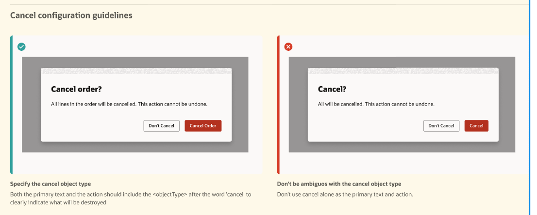
Problem
The writing guidance team identified a missing use case in the dialog component's configuration: destructive dialogs where Cancel needs to be the primary action and "Don't Cancel" the secondary, inverting the standard pattern.
Actions
Worked with component teams to surface dialogs requiring the new Cancel configuration. Documented the writing pattern for this new configuration in the component specs and writing guidelines. Coordinated review with design org.
Outcome
Component specifications reviewed and approved for updates by the design org. Writing guidelines updated and announced to the design organization, giving product teams clear direction for this previously undefined pattern.
Empty State Messages
Multi-link SupportProblem
The component team added support for multiple links in empty state messages, where previously only one action and one link were supported. Existing writing guidance did not account for this new configuration.
Actions
Worked with the component team to determine how multi-link actions should be handled in the design. Reviewed several different explorations. Wrote text for empty state examples in component specifications. Assessed the impact to writing guidelines and coordinated review with the writing guidance team.
Outcome
Component spec reviewed and approved by design org and leaders. Writing guidance updated and approved for the new multi-link empty state configuration.
Research
Using research to validate UI copy decisions at the system level
Writing guidelines need to be grounded in how users actually understand language, not just what sounds right to writers. Where possible I conducted original research to validate guidance decisions before they were announced to the organization.
When the working group debated whether "You're all caught up" or "You're up-to-date" better served users finishing a task list, including users whose first language is not English, I ran an A/B study rather than resolving it by opinion alone.
Method. I conducted A/B testing with 10 participants total, 5 native English speakers and 5 non-native speakers. Sessions used a think-aloud technique with alternating starting patterns and follow-up questions designed to surface the "why" behind preferences.
Results. 4 of 5 non-native speakers and 3 of 5 native speakers preferred "You're up-to-date." Multiple participants noted that "all caught up" implied they had been behind, a negative connotation the message was not intended to convey. Non-native speakers found the idiom harder to parse.
Outcome. Results presented to the working group and approved. The default empty state message for completed task scenarios was updated to "You're up-to-date." across the guidelines, a guidance decision now backed by evidence rather than editorial preference.
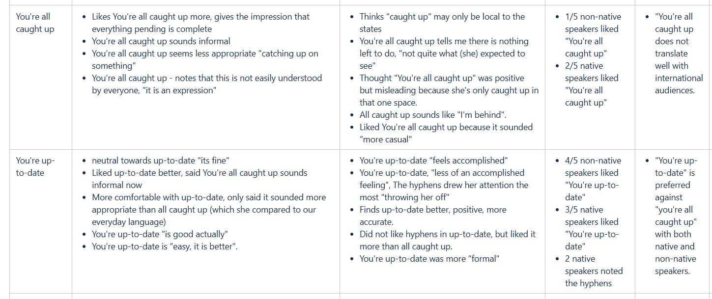
Comparative findings by speaker group, drawn from the study's session notes.
Outcomes
The cumulative impact of content governance at scale
The value of a content governance function is difficult to measure in the same way as a single shipped feature, but it shows up in the consistency, reliability, and quality of every product that draws on the guidelines.
Outcomes
Guidance that scales
The UI Text Working Group maintained active guidance across dozens of component types, serving hundreds of Oracle writers, designers, and PMs who relied on it to make consistent content decisions across the product suite.
Research-backed decisions
Introduced original UX research into the guidance process, including multilingual A/B studies, moving key content decisions from editorial judgment to evidence-based validation.
Operational stability
Assumed ownership of the working group during a period of significant leadership restructuring. Built the JIRA kanban board from scratch to bring transparency and structure to a previously informal process, ensuring continuity through organizational change.
Cross-functional alignment
Facilitated alignment between content, design, and engineering leadership on contested terminology and patterns, including nomenclature decisions (Copy vs. Duplicate) that cascaded across multiple component teams and product areas.
Organizational reach
Guidance updates were announced to the whole Oracle UX organization through a structured release process, ensuring changes reached the writers who needed them rather than sitting in a document nobody found.
A model for content governance
The working group structure, kanban board, and Slack support channel together formed a replicable content governance model, one that demonstrated how content can be managed as a system, not just a deliverable.