Context
One component family, dozens of message types
Messages, which include progress banners, toasts, empty states, and dialogs, are some of the highest-frequency components in Redwood. Nearly every product interaction eventually surfaces one: a save confirms, an import fails, a list has nothing in it yet. Because they're so frequent, inconsistency here is the fastest way to make an enterprise product feel unpolished.
I partnered directly with the Messages component team as they built and evolved these patterns, writing the UI text for component specifications and translating open design questions,how should a progress banner behave versus a toast, when does an empty state need an action, how much detail belongs in an error, into concrete, reusable writing guidance.
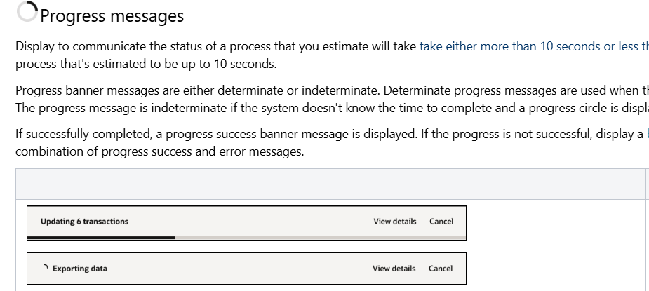
Progress banner examples: determinate and indeterminate states for a multi-step operation.
Anatomy of a message
Breaking a banner down to its writable parts
Before writers can apply guidance consistently, they need a shared vocabulary for what they're even writing. I documented the anatomy of a banner message: icon, primary text, secondary text, actions, and close control, so every guidance decision could reference a specific, named part rather than "the text at the top."

Annotated breakdown used to align writers, designers, and engineers on shared terminology.
Component guidance
Writing for what a button actually does
Message and action guidance has to account for system behavior, not just wording. On transactional pages, an Apply button keeps data in cache while a Cancel button discards it and returns to read-only mode, but on non-transactional pages, changes commit immediately. Getting this distinction right in the guidance prevents writers from applying the wrong pattern to the wrong page type.
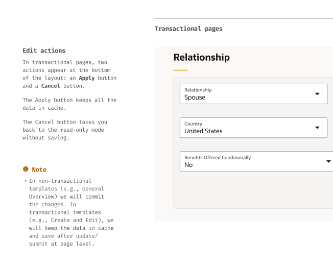
Guidance distinguishing Apply/Cancel behavior on transactional pages from immediate-commit behavior elsewhere.
The work
Examples in production
Two representative messages that shipped from this guidance, an error and a warning, each written to tell the user exactly what happened and what to do next.
Import error
Error Banner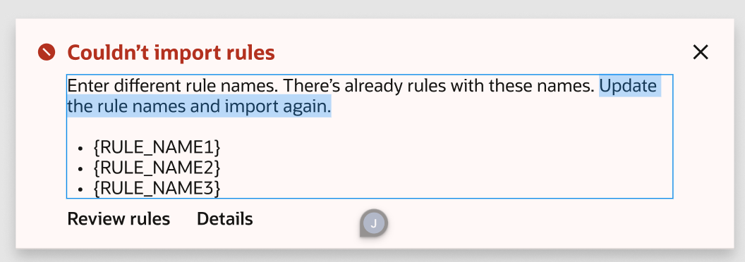
Names the specific rules that failed to import and gives the user a direct fix (rename the conflicting rules) rather than a generic "something went wrong."
Inherited membership change
Warning Banner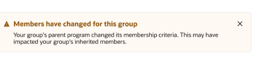
Surfaces a side effect the user didn't directly cause (a parent program's membership criteria changed), so they understand why their group looks different without digging for an explanation.
Outcomes
Consistent messaging across the system
This work feeds directly into the Redwood UI Text Writing Guidelines, so every product team building on Redwood inherits the same message patterns rather than reinventing them.
Outcomes
Shared vocabulary
Documented the anatomy of a message so writers, designers, and engineers could discuss guidance using the same named parts.
Behavior-aware guidance
Tied writing patterns to actual component behavior, like transactional versus immediate-commit actions, instead of wording rules alone.
Reusable across products
Patterns developed here became part of the broader UI Text Writing Guidelines, reused by every team building on Redwood messaging components.