Context
A developer-first audience with no shared UI language
Contrast Security builds application security tooling that developers and security engineers rely on to find and fix vulnerabilities before they ship. When I joined, the product had grown across multiple teams and languages (Java, Node, Python, Ruby, .NET, and more) without a single writer or content process attached to any of it. UI terminology drifted team by team: the same concept could be labeled three different ways depending on which part of the product you were in.
Contrast's audience compounded the problem. Developers evaluating a security tool are skeptical of soft, marketing-flavored language, and rightly so, since the product exists to protect their company from attacks that could cause real harm. Any writing process introduced here had to earn credibility with an engineering-led org, not just impose a style guide on it.
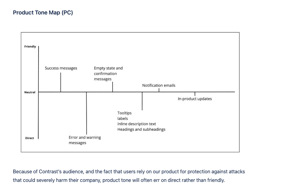
The Product Tone Map I created to plot message types, from success banners to error and warning messages, against how friendly or direct they should read.
My approach
Building a writing process the engineering org would actually use
There was no existing UX writing function at Contrast to inherit, so the first job was establishing one. I led the implementation of a UX writing process into the engineering and development workflow, rather than trying to run content review as a separate, bolt-on step.
I developed a content strategy and scalability roadmap so the process could extend across Contrast's full product portfolio as it grew, not just the screens I happened to touch first. Alongside the process work, I wrote microcopy for user touchpoints directly in the interface, contributed writing to the internal design system, and kept product documentation and release notes current as features shipped.
"Because of Contrast's audience, and the fact that users rely on our product for protection against attacks that could severely harm their company, product tone will often err on direct rather than friendly." (from the Product Tone Map rationale)
Research
Two studies: how developers talk, and how they navigate
Before I could standardize terminology, I needed to know which words developers already used and trusted, and whether the documentation was organized the way they think. I ran two studies.
Conversation mining. To build a vocabulary that fit a developer-first mindset, I tracked developer conversations on StackOverflow, Reddit, Twitter, Discourse, Discord, and Slack, collected the terms people actually used, and compared them with what Contrast used. I also noted the attitude and emotion in those conversations, so I could see the sentiment around a word in context. The result was a confirmed terminology list for the UI and the documentation.
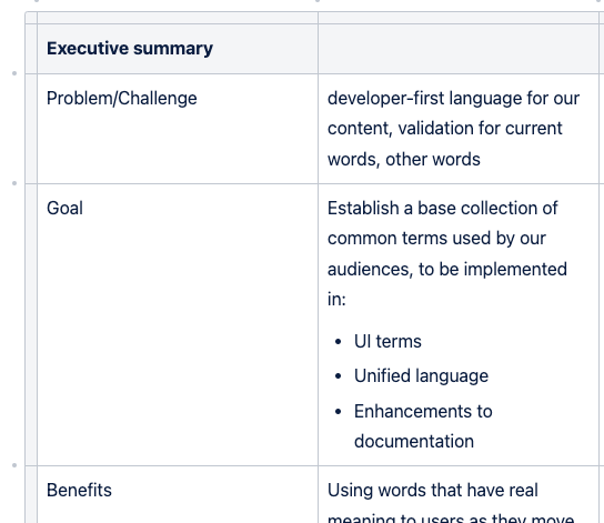
The executive summary I used to frame the problem for engineering leadership.
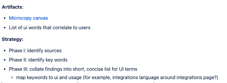
The three-phase plan: identify sources, identify key words, collate into a concise UI terms list.
Card sort. To test whether the documentation's navigation matched developers' mental models, I ran a card sort with 15 cybersecurity software engineers who were new to Contrast. Each card was one of the 38 second-level topics on a Miro board. Participants grouped the cards, labeled the groups, and thought aloud while two moderators ran the same script over Zoom. Any group of more than 10 cards had to be split again.
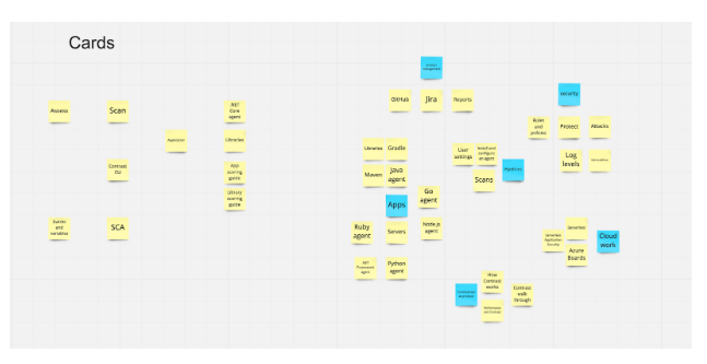
The card sort board in Miro.
Some of the structure held up: how agent topics, marketing topics, and product offerings were grouped. The CLI, integrations, frameworks, scoring guides, policies, and permissions were confusing or grouped differently than the documentation had them. The think-aloud comments explained why, and which words carried little meaning, so I revised the information architecture of the documentation based on how developers grouped the information. To validate the new structure, I proposed usability testing and reverse tree testing to the team.
Style guide
Turning research into guidance writers and engineers could apply
The vocabulary research and tone map fed directly into a writing style guide I built and distributed, covering everything from how to phrase a call to action to how to write an error message a developer would actually trust. I kept every rule paired with concrete Do/Don't examples, since abstract principles rarely change how an engineer writes a button label under deadline.
Clear calls to action
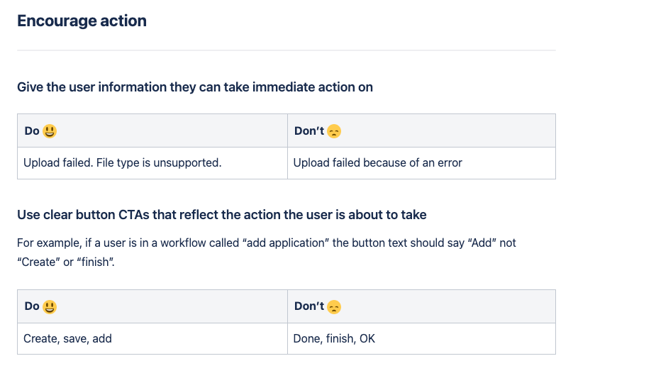
Guidance on writing buttons and links that tell the user exactly what will happen, with Do/Don't examples pulled from real product copy.
Tone rules
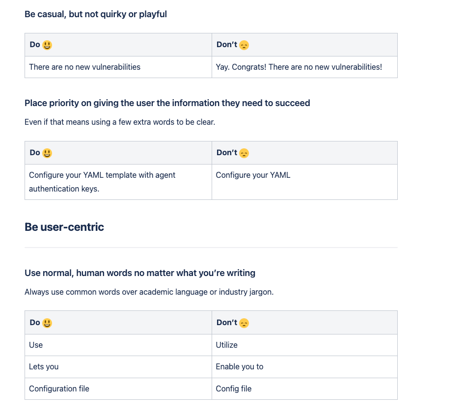
Rules like "be casual, but not quirky" and "be user-centric," written to keep the product's voice consistent without flattening it into generic corporate copy.
Error messages

A writing checklist for error states, since a security tool that reports failures unclearly erodes exactly the trust it's meant to build.
Applied example
Rewriting the agent-install onboarding flow
The "Add agent" flow (how a developer connects Contrast to their codebase) was one of the first places I applied the new guidance directly. The original flow dropped a developer into a single, unlabeled "quick start" step with no sense of how many steps remained or what to do next.
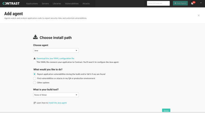
Before: a single unlabeled step with no path forward.
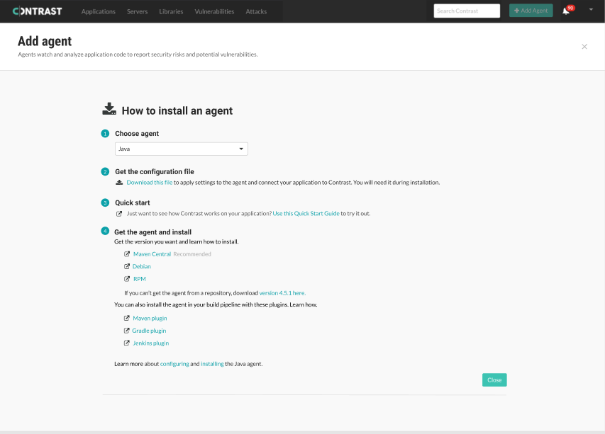
After: a clear, numbered four-step flow (choose agent, get the config file, quick start, install).
I annotated the rationale directly on the design so engineering understood why each field's conditional state mattered, not just what the copy said.
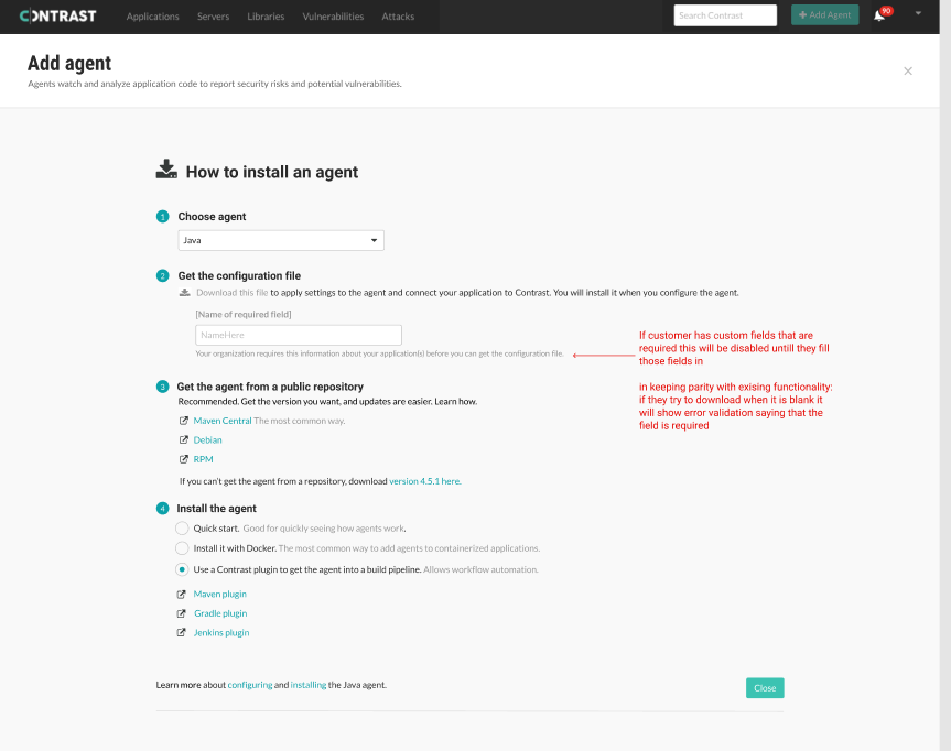
Annotated redlines documenting why each step and field behaves the way it does.
Outcomes
Standing up a content function from nothing
Contrast had no UX writing process before this work, and a full one, research-backed, documented, and embedded in the engineering workflow, by the time I left.
Outcomes
Process, not one-off cleanup
Embedded UX writing into the engineering and development workflow itself, so content review became a standard step rather than a favor engineering had to request.
Research-grounded terminology
Replaced ad hoc, team-by-team naming with a shared UI vocabulary derived from mining real developer conversations, and a documentation structure tested with a card sort, not a top-down style mandate.
Built for scale
Developed a scalability roadmap so the writing process could extend across Contrast's full product portfolio as new language agents and integrations shipped.
Usability metrics tracked
Tracked the potential impact of writing changes on product usability, giving engineering leadership a way to evaluate content work in terms they already used.
Applied, not theoretical
Used the agent-install onboarding redesign to demonstrate the style guide in practice, turning an unlabeled single step into a clear, numbered flow.
Design system contribution
Contributed writing directly to the internal design system, so new components inherited on-brand, on-tone copy by default rather than requiring after-the-fact review.